
.webp)
In 2026, kitchen design is moving away from cold minimalism and fleeting “statement kitchens.” They are being replaced by warm minimalism, with a more cohesive visual image, an emphasis on natural textures, and thoughtful layouts that are comfortable for everyday life.
In practice, the best kitchens of 2026 are built according to a logical and proven sequence: first the layout, then storage, materials, color, and lighting. This approach allows you to create a space that looks minimalist but remains reliable, functional, and cozy.
Warm Minimalism Becomes The New Baseline
Warm minimalism is minimal design that still feels comfortable in real life. The fastest way to get it is consistency: one door style and a restrained set of finishes repeated across the full kitchen.
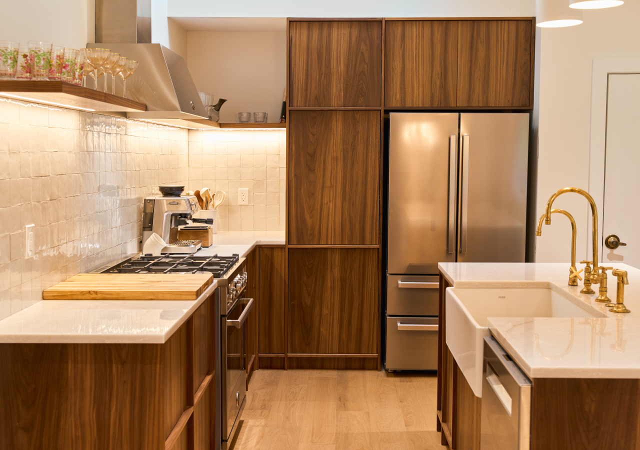
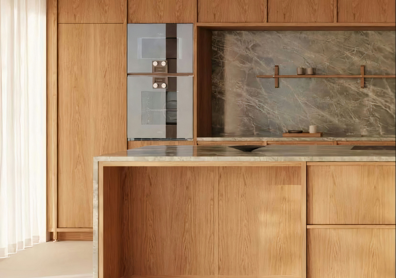
Warm minimalist kitchens keep flat fronts and clean geometry, but they stop feeling sterile because the warmth comes from how surfaces behave in light. Matte finishes soften glare, wood grain adds natural variation without looking “busy,” and quieter metals (brushed, satin, muted) add definition without sparkle. The easiest way to make this trend look intentional is to decide where your warmth lives: wood on the island or tall run, matte on the main cabinetry, and one calm countertop that does not fight both. Then treat visual breaks as a design cost.
Too many open shelves, mixed hardware, or multiple countertop materials create interruption and make the kitchen feel less continuous. Instead, add depth through texture—wood grain, soft-touch matte surfaces, subtle stone movement—so the kitchen feels calm in both daylight and evening light.
Color In 2026: Warm Neutrals Plus One Saturated Block
Cabinet color trends warmer because it reads softer in daylight and less harsh at night. Use one calm base everywhere, then add personality with a single concentrated color moment (island, tall run, or niche).
Cool whites and icy grays give way to cream, sand, clay, warm greige, olive, sage, and cocoa tones. These palettes feel grounded because they work with natural light instead of fighting it, and they hold up over time because they avoid sharp contrast. The practical way to use color is to assign roles: a neutral for the largest planes (main cabinetry), a supporting tone (wood or a second neutral), and a single “block” that gives character without fragmenting the room.
The block works best when it’s architectural rather than decorative: an island, a full-height pantry wall, or a niche that reads like a built-in. What usually breaks this trend is adding multiple accents across the space: a bold island, plus colorful uppers, plus mixed tile, plus contrast hardware. That combination creates visual noise and makes the kitchen feel less calm, even if each choice is nice on its own.
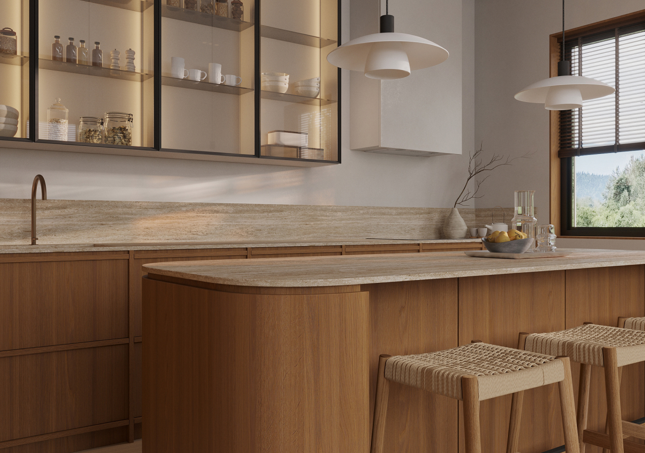
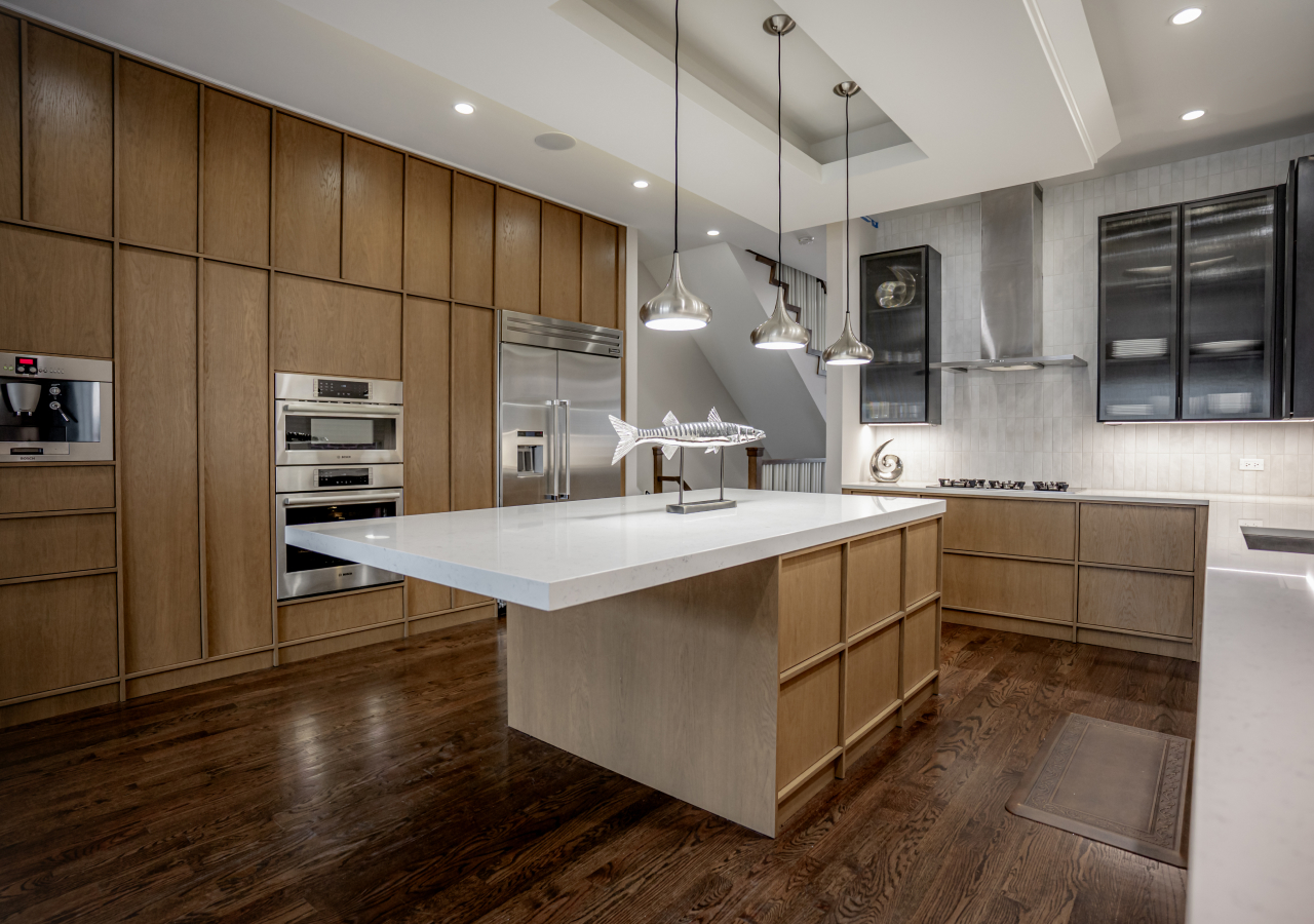
Wood-Forward Kitchens Feel More Like Furniture
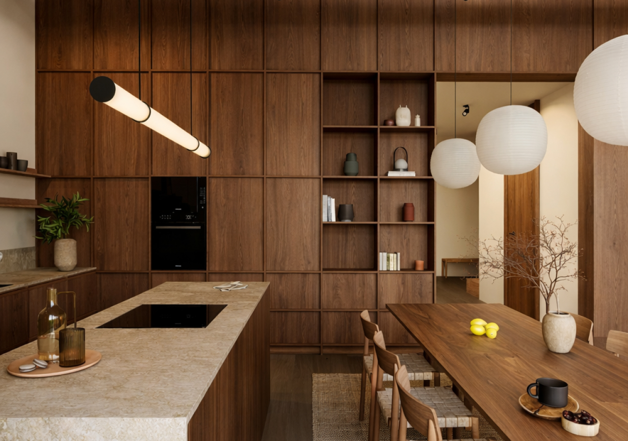
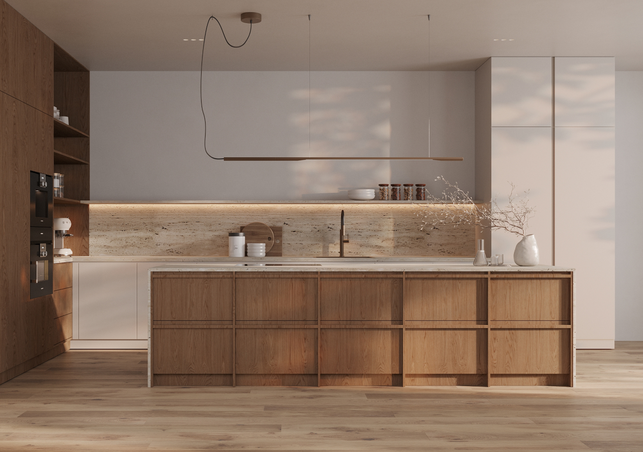
In 2026, wood is often treated as the primary “furniture material”, not a small accent. The control rule is simple: choose one wood tone and repeat it in the most visually dominant elements (island, tall block, or main run). This keeps the space calm and prevents mixed-species clutter.
Wood is no longer used only as a “warm detail.” It often becomes the main visual anchor, especially in islands and tall cabinet runs, because it makes the kitchen read like furniture rather than a set of separate boxes. The key is not only choosing one tone, but choosing the right placement: wood works best where the eye naturally rests (island face, tall pantry wall, a continuous run), while the supporting finish stays quieter so the room doesn’t feel heavy.
If you want the look to feel premium, keep the wood consistent across doors, panels, and any open elements so it doesn’t look patched together. Then pair it with one calm companion finish such as matte lacquer, matte Fenix, or restrained stone. The result feels intentional and long-lasting because the wood is doing the “character” job, while everything else stays disciplined.
Stone Continuity Feels Architectural, Not “Busy”
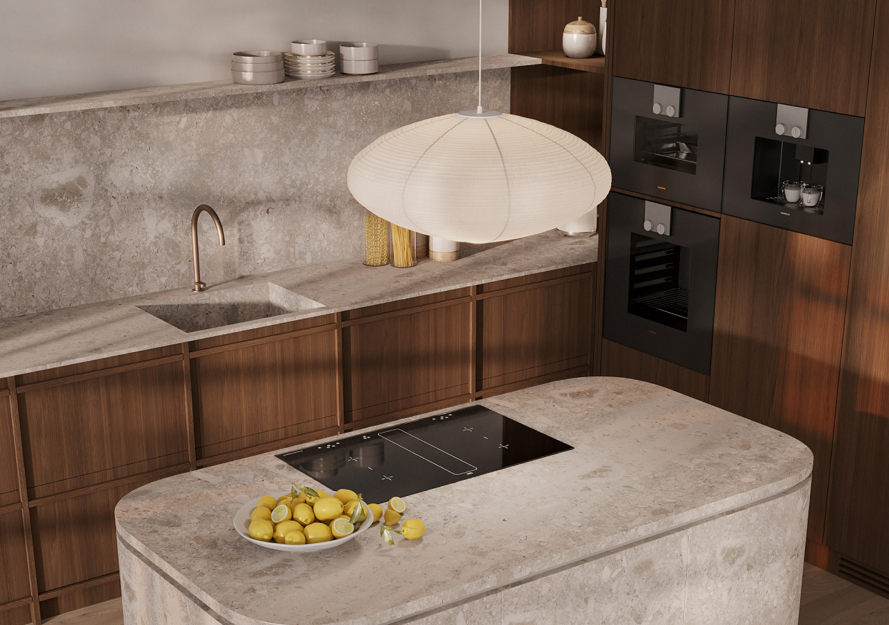
A single stone plane (counter + splash) makes the whole wall read cleaner. Keep movement subtle unless cabinetry is completely quiet. The 2026 version prioritizes warm undertones and subtle movement so the surface reads architectural rather than loud.
Stone remains a focal surface, but the 2026 approach is more controlled because continuity reduces visual breaks. The most common move is to treat the counter and backsplash as one composition, which reads calmer than switching materials at the wall line. Where people go wrong is selecting stone with high-contrast veining and pairing it with textured cabinetry, open shelving, or multiple metals, because too many “statements” competing.
A simple balancing rule makes this trend easy: expressive stone countertop pairs best with quiet cabinetry, while textured cabinetry pairs best with calmer stone. Warm undertones also matter more than before; they help stone sit naturally next to wood and warm whites without feeling icy. Done well, the effect is sculptural calm—more architectural plane than decorative pattern.
Texture Replaces Ornament
Skip decoration and let surfaces do the work: matte, grain, brushed metal, plaster, restrained tile. Use one standout texture, not several, which can compete with each other. Keep forms simple so texture adds depth without turning into visual noise.
Instead of decorative details, kitchens lean on layered texture: matte fronts, wood grain, plaster-like walls, brushed metal, and restrained handmade tile. The goal is to make the same simple forms feel richer up close. A useful rule is “one metal finish, repeated” across faucet, hardware, and lighting, because mixed metals often read like indecision in minimalist kitchens.
Another rule is concentration: if you use a standout surface (handmade tile, ribbing, plaster), give it one clear location so it reads intentional, like a backsplash zone, an island face, or one niche. Texture works best when it supports the overall composition staying quiet; it should add depth and warmth, not shout for attention.
Curves And Softened Edges Feel More Human
Curves in 2026 are used as a comfort and flow tool, not a theme everywhere. The most common application is rounded island ends and softened circulation corners to reduce collisions and hard geometry. Consistency matters: repeating the same radius makes the design feel intentional.
Curve design continues to grow because they solve a real issue in open-plan kitchens: hard geometry everywhere can feel sharp and overly “architectural,” especially where people pass closely. Rounded island ends, softened peninsula corners, and eased transitions make movement easier and make the kitchen feel more human without changing the minimalist language.
You do not need to curve every element; that usually becomes a theme and can look trendy fast. Instead, apply curves where they improve circulation or safety and keep the curve language consistent by repeating the same radius. Done well, curves make warm minimalism feel more livable while still looking clean and disciplined.
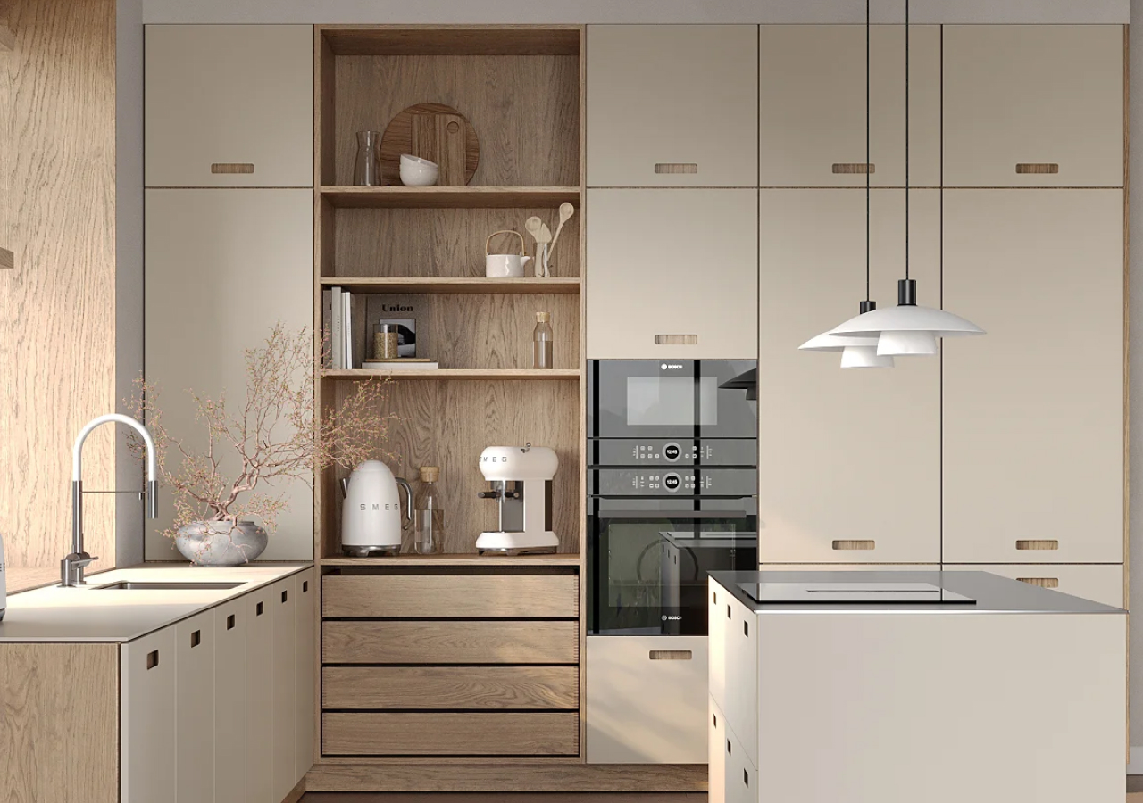
Concealed Function: Appliances, Charging, And Tech Disappear
The practical shift in 2026 is “fast reset”: clutter zones are designed to disappear behind doors. Popular solutions include appliance garages, pocket doors, integrated appliances, concealed charging, and “invisible” smart features. The planning rule: identify your daily clutter list (coffee/toaster/chargers/snacks) and design a single dedicated zone to contain it.
This is the biggest functional trend because it changes how the kitchen looks after use. Instead of trying to keep counters clean through discipline, the kitchen is designed so the mess has a home. The most effective approach is to plan around real clutter zones: coffee gear, toaster, chargers, snacks, pantry overflow, paper towels, and the things that drift out during weekdays. Group them into one dedicated area and hide them behind doors, or place them in an appliance garage so the rest of the kitchen stays visually quiet.
Pocket doors are especially useful when you want the zone to disappear completely without swing space, while an open garage works when daily access matters and the contents are controlled. Smart tech should support routines quietly—lighting scenes, sensors, under-shelf task lighting—without adding screens or visual noise.
Pantry Walls And Back-Kitchen Logic Gain Ground
A pantry wall applies “back-kitchen logic” without needing a second room: it concentrates mess-heavy tasks and small appliances into one concealed zone. The benefit is operational: clear counters, faster reset, smoother daily flow. Store daily items at arm’s reach and push occasional-use items higher.
Walk-in pantries and back kitchens are growing, but the principle works even without a second room. The idea is to move mess-heavy tasks and small appliances into a dedicated zone so the main kitchen stays calm. A strong solution is a pantry wall with a concealed coffee/appliance area behind doors, plus shelves and drawers planned around daily use.
Store everyday items at arm height so the kitchen runs smoothly, and place occasional appliances higher up or deeper in the wall so they don’t steal the most accessible space. The benefit is reduced clutter and better flow, because the “busy” part of kitchen life is contained.
Islands Become The True Center, With Real Planning Rules
Island planning in 2026 is stricter: flow first, storage second, seating third. Use measurable clearances—36–42 inches for work aisles and 42–48 inches for high-traffic routes—to prevent daily friction. Protect one uninterrupted prep zone and avoid stool placement that blocks fridge/dishwasher paths.
Islands matter more than ever because they carry the most daily activity, but they also create the most daily friction if spacing is wrong. After clearances are set, the next decision is the island’s job: prep surface, cleanup support, storage hub, seating, or a mix, but with one primary function. Seating needs real planning: allow about 24 inches per person and a 12–15 inch overhang for knee space, and keep stools from blocking the fridge, dishwasher, or main routes.
Storage should match the function: deep drawers for dishes and prep tools, waste pull-out near prep, and landing zones that make unloading and cooking feel effortless. A great island feels invisible in use; a bad one is felt every day.
High-Performance Matte Surfaces Win On Daily Use

Matte, fingerprint-resistant finishes are popular in 2026 because they keep the kitchen looking composed in real use. Matte surfaces reduce glare and make warm palettes feel richer, especially under evening lighting. Prioritize durable finishes at high-touch zones near the fridge, trash pull-out, and cooking area.
The finish direction is simple: surfaces that look calm and stay that way. Matte fronts hold up better in daily life because they don’t turn reflections and smudges into constant visual noise, and they make warm colors look deeper rather than washed out. The practical move is to map high-touch zones: the cabinet by the fridge, the trash pull-out, the drawer you open while cooking, the area around the sink. Those are the places where durability matters most, and where a fingerprint-resistant finish pays off.
This trend is less about fashion and more about longevity: a kitchen that still looks composed after years of real use.
Conclusion
Kitchen design in 2026 shifts the focus from striking details to a space that quietly and comfortably supports everyday life. Warm minimalism, natural materials, and hidden functions are perceived not as fashion trends, but as decision-making principles: simplify the visual field, choose durable and pleasant-to-touch surfaces, and think through storage so that calmness comes naturally.
To sum up the idea in one sentence: first plan the workflow and storage areas, then choose a restrained palette that will be repeated and tie the space together.


