
.webp)
The color of your kitchen shapes how the space feels—open and bright or warm and intimate. And because cabinets take up so much visual space, decisions about kitchen cabinet colors often matter more than the wall color itself. If you’ve been wondering what color to paint kitchen cabinets or how to build a palette around your floors and countertops, this guide will walk you through the key steps.
We’ll look at the basics of color palettes, undertones, lighting, and materials so you can choose shades that feel calm, timeless, and right for your space.
Understanding Color Palettes for Kitchens
When you choose colors for a kitchen, you’re deciding how the room will feel every day, not just which swatch looks nice on a screen. A simple way to orient yourself is to think in terms of the color wheel without getting lost in technicalities.
Primary colors (red, yellow, blue) sit at the core of the wheel. By mixing them you get secondary colors (green, orange, purple), and in between those are tertiary hues like yellow-green or red-orange. You don’t need to memorize all of this; what matters is how these colors relate to each other in the room.
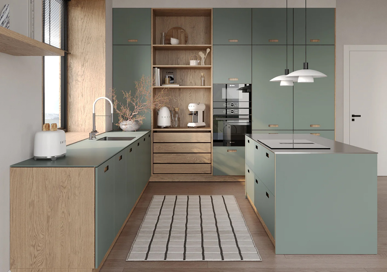
Colors opposite each other on the wheel create contrast and energy. In a kitchen, that might look like deep green cabinets with warm copper accents, or blue-gray cabinets with warm brass hardware. Colors that sit next to each other on the wheel create softer transitions; think of a palette that moves gently from warm white to sand to soft clay, or from blue-gray to ink blue.
Most real kitchens end up somewhere in between: a calm, neutral base with one or two contrasting tones in the island, stone, or hardware so the room feels layered but not busy.
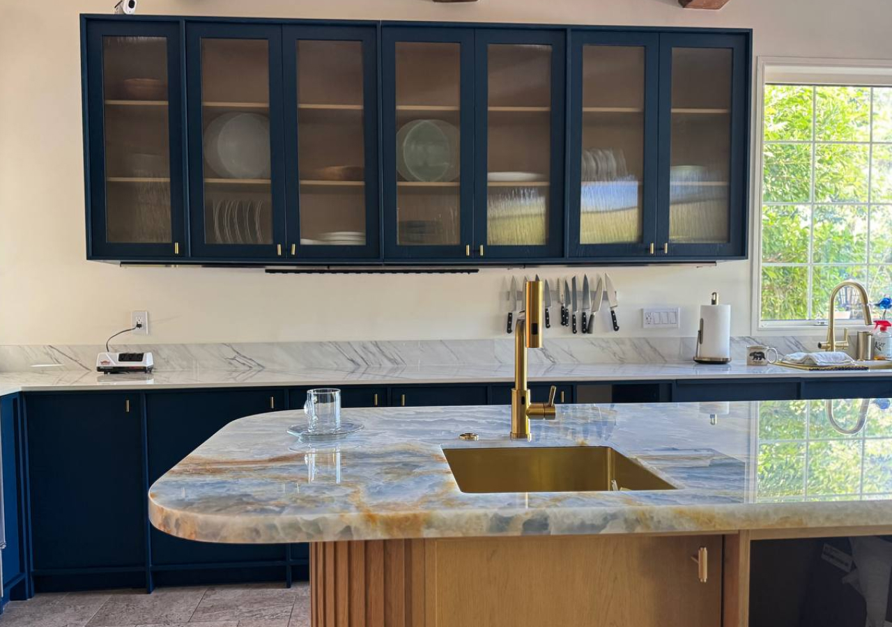
Undertones 101 for Kitchen Cabinet Colors
Most “neutrals” aren’t neutral at all. They have undertones that decide whether your kitchen feels cozy, crisp, or unexpectedly cold.
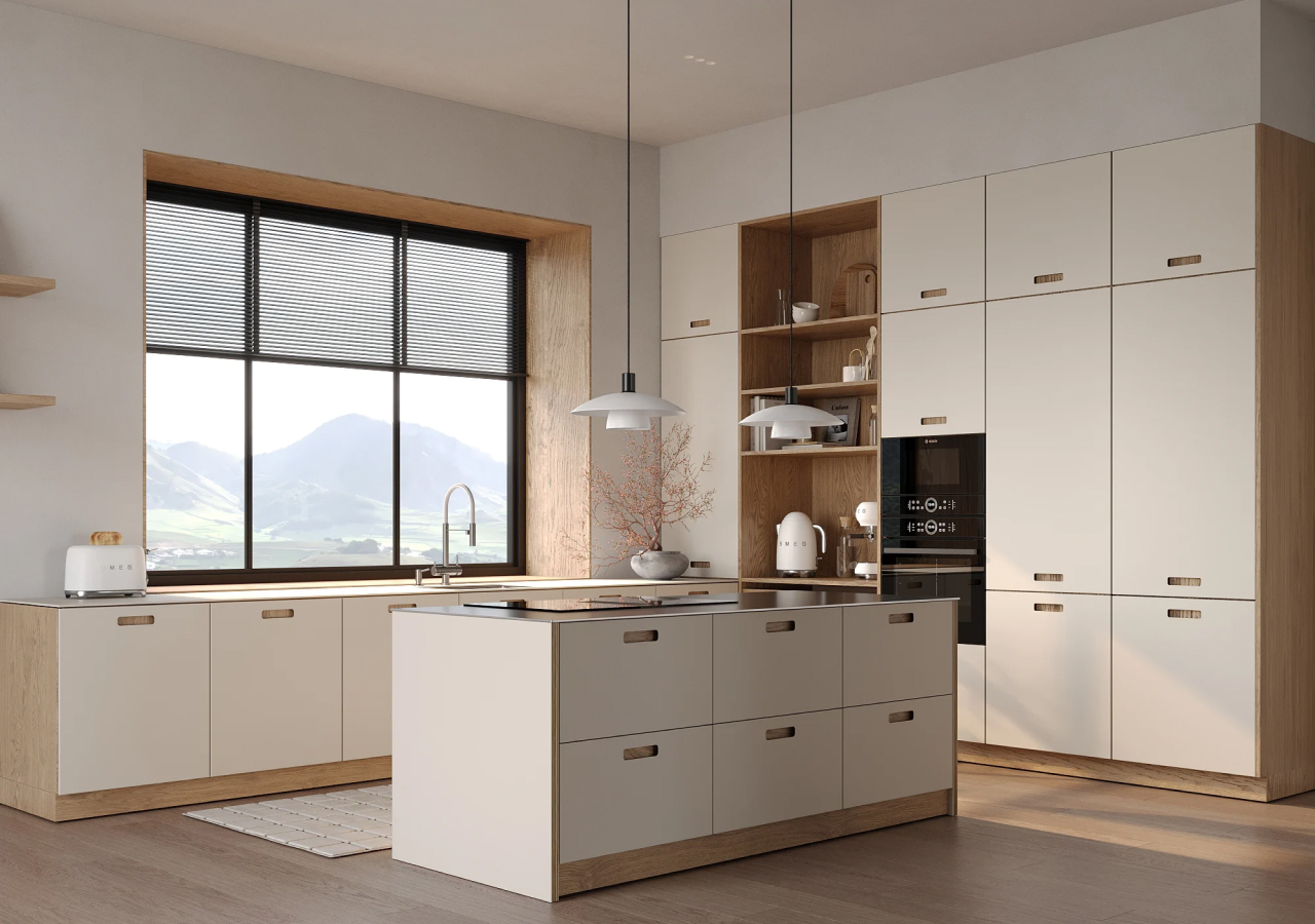
Warm whites carry a touch of yellow or red. They tend to sit beautifully next to oak floors, warm stone, and brass or champagne hardware. In a north-facing kitchen or a space with limited natural light, a warm white cabinet color will usually feel softer and more forgiving.
Cool whites lean blue or gray. They look sharp with concrete, stainless steel, and very modern architecture, but in a dim or north-facing room they can go flat or slightly icy. This is where many people end up repainting because the “clean white” they chose suddenly reads blue.
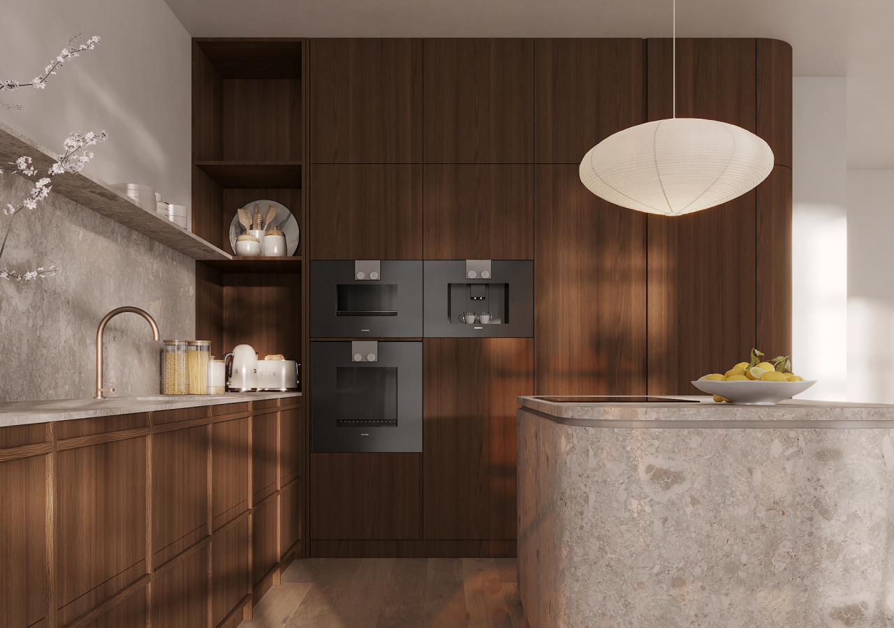
Greige, the mix of gray and beige, is its own territory. Some greiges lean warm and work well with walnut and beige stone; others pull violet or pink in certain lights and clash with yellow-based floors. This is the classic undertone trap: a color that looked perfectly neutral online starts to look lavender once it’s next to your oak flooring.
A few real-world examples help:
- A warm white cabinet with light oak floors and a beige stone countertop creates a calm, Japandi-style feel.
- A cool white cabinet with gray quartz and stainless appliances feels crisp and modern, but can read colder, especially in low light.
- A greige cabinet with walnut and soft white walls gives a more tailored, sophisticated look, particularly in open-plan spaces.
Before you commit, hold cabinet and paint samples directly against your flooring and countertop. If the undertones fight each other, they won’t magically align once the whole kitchen is painted.
How Lighting Changes Kitchen Colors
The same cabinet color can look completely different in the morning and evening, which is why lighting is just as important as the swatch itself.
Natural light sets the base. North-facing kitchens usually receive cooler, softer light that can make colors look grayer and flatter; warm whites, beiges, and gentle greiges tend to perform better here. South-facing kitchens enjoy a warmer, more consistent light, so they can handle a broader range of colors—from soft whites to deeper greens and charcoals, without feeling gloomy.
East-facing spaces feel fresh and bright in the morning and calmer later in the day; warm tones practically glow at breakfast but should still be tested in afternoon light. West-facing kitchens are quieter in the morning and then fill with warm, sometimes orange-toned light at sunset. Strong golden light can intensify certain wall or cabinet colors, so it’s worth checking how your chosen shade behaves in the evening.
Artificial light finishes the job. Most modern kitchens rely heavily on LED strips and downlights. Warmer LEDs (around 2700–3000K) soften edges and make wood and warm neutrals feel cozy. Neutral white (3000–3500K) is a good everyday balance for task lighting. Cool white (4000K and above) emphasizes clarity and can work in very modern, graphic kitchens, but may make warm cabinets look slightly green or dirty.
If you’re choosing what color to paint kitchen cabinets, test your samples under the exact lighting you plan to use, especially under-cabinet strips and pendants in the evening, when the kitchen works hardest.
Choosing Kitchen Colors by Style
Your kitchen style is a helpful filter for narrowing down color choices. The same white or green can feel completely different in a minimalist, Scandinavian, Japandi, or wabi-sabi space.
Minimalist kitchens usually rely on a quiet base: white, light gray, or soft beige cabinets paired with low-contrast materials. The goal is clarity and function, not visual noise. Color comes through in subtle contrasts: perhaps a darker island, a soft gray stone, or matte black hardware. If you’re aiming for something that ages well, think in terms of timeless, low-contrast combinations rather than high-drama feature colors.
.webp)
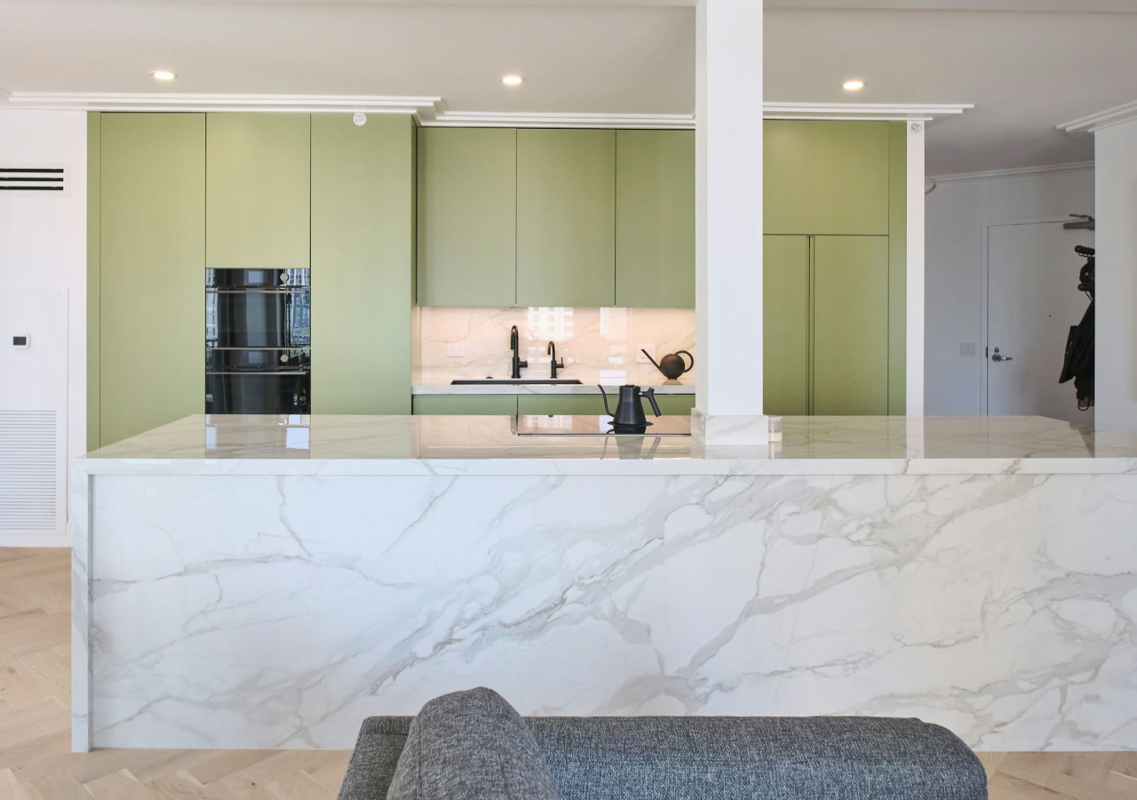
Modern kitchens work well with slightly stronger contrast. You might see warm white perimeter cabinets with a deep green or charcoal island, or soft greige cabinets with dark stone and slim, linear hardware. The palette is still controlled, but there’s more emphasis on sharp lines and clear edges.
Scandinavian kitchens favor light and airiness: white or very soft off-white cabinets, pale oak, gentle grays, and occasional muted color in textiles or a single accent piece. The feeling is bright and unobtrusive, with color serving the light rather than fighting it.
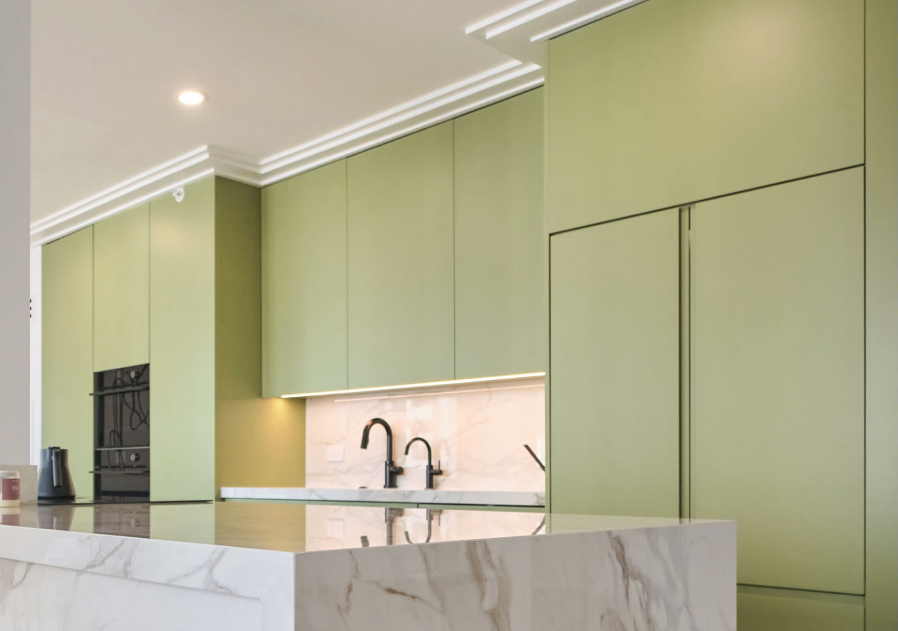
Japandi kitchens mix Japanese simplicity with Scandinavian warmth. Here, kitchen cabinet colors lean toward warm neutrals, greige, and soft earth tones, anchored by natural woods like oak or walnut. Deep accents, like forest green, ink blue, charcoal, tend to appear in small, intentional ways, so the room stays serene. If you’re trying to add warmth through color and materials rather than decor, this is a good style to reference.

Wabi-sabi kitchens celebrate natural imperfection and patina. Colors are often muted and earthy: olive, terracotta, clay, mushroom, warm gray-green. Surfaces look touched by time rather than pristine. The palette isn’t about perfect matching; it’s about a sense of grounded comfort.
As you read about different styles—timeless kitchens, Scandinavian neutrals, Japandi warmth, modern vs contemporary—notice which descriptions feel like your home. Color choices become much easier when the style is clear.
Kitchen Colors by Size and Layout
Color also affects how large or intimate your kitchen feels. In compact or narrow spaces, lighter tones help the room breathe. Soft whites, light gray, greige, and beige reflect more light, and when the cabinets and walls are close in value, the eye doesn’t stop at every line. This makes a small kitchen feel quieter and more open.
In a small galley or U-shaped kitchen with limited daylight, a pale palette can be the difference between feeling compressed and comfortable. You can still add personality—a deeper tone on the island end panel, a warm stone with subtle movement, a richer color on stools, but the backbone of the room remains light.
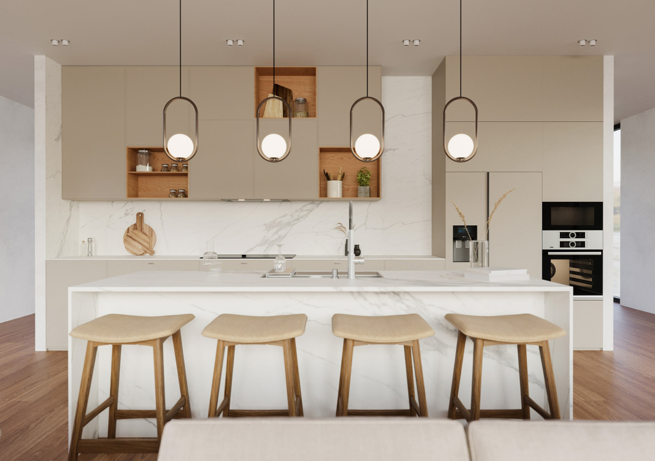
Larger kitchens can comfortably hold more depth. Deep blue, charcoal, forest green, or even near-black cabinets can feel inviting rather than overwhelming, especially when they’re balanced with lighter walls, stone, and wood floors. Two-tone schemes—light uppers with deeper bases, or a darker island in a lighter room—help visually zone the kitchen without fragmenting it.
Instead of thinking in terms of “light vs dark” as good or bad, consider what the room needs: more openness and reflection, or more weight and intimacy.
Choosing Colors by Material
Most people don’t start with a blank slate, but are working with existing floors, stone they already love, or appliances that need to stay. That’s why it’s useful to choose kitchen cabinet colors in response to your main materials.
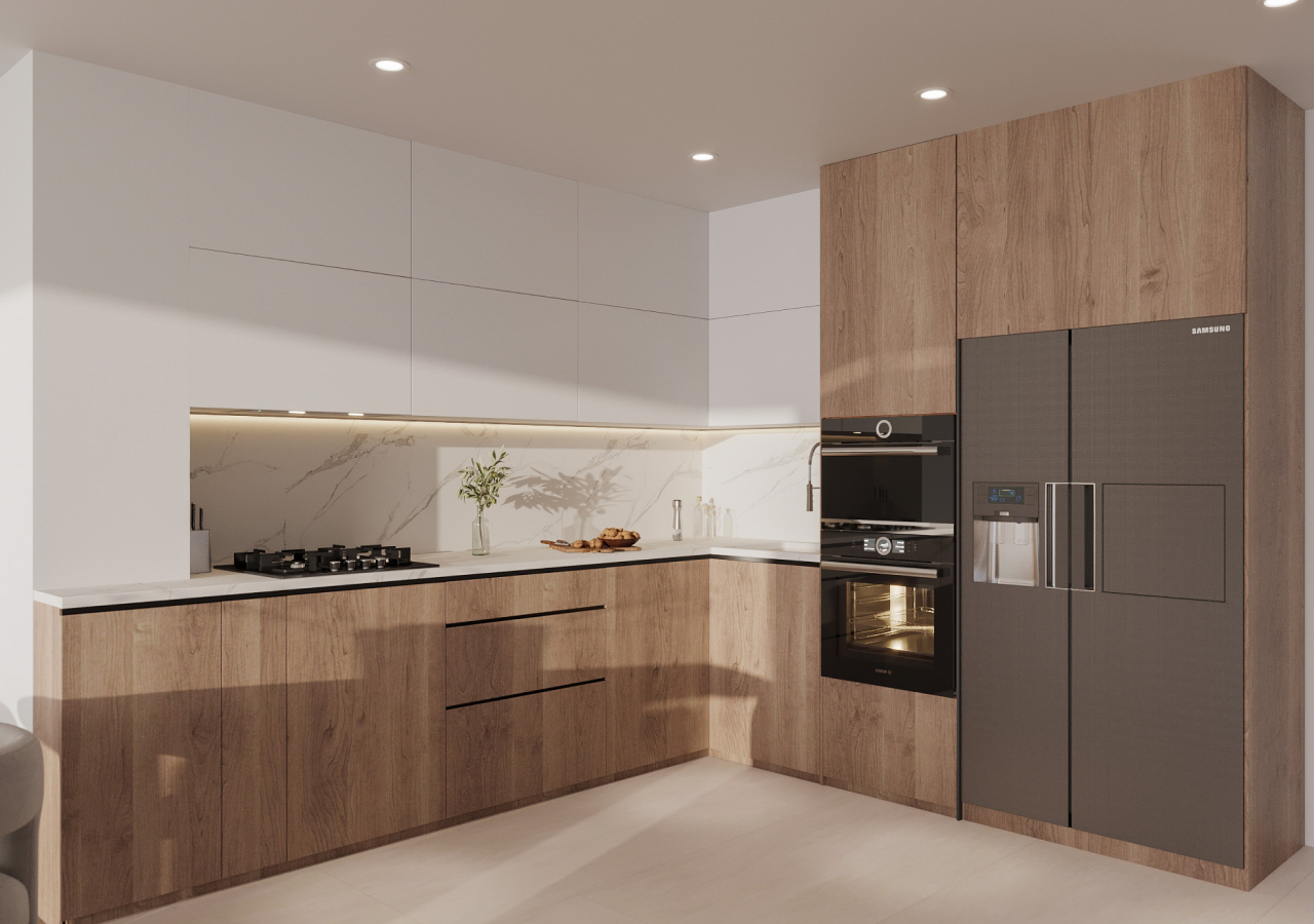
Light oak floors or cabinetry naturally pair with warm whites and soft beiges. This combination feels calm and forgiving, particularly in Japandi or Scandinavian-inspired spaces. If you introduce a color, it typically works best as a gentle green, gray, or clay rather than a very bright primary.
Walnut has a deeper, more dramatic grain. It comes alive next to greige or soft beige cabinets and walls, which soften the contrast while still acknowledging the richness of the wood. This palette works particularly well in open-plan rooms where the kitchen is visible from the living space.
If you’ve chosen a bold marble or quartz with strong veining, let the stone play the lead. Quieter cabinet colors—soft whites, warm grays, and gentle greiges—support the stone instead of competing with it. This is often the safest direction when you’re searching for the best color for kitchen cabinets with busy marble countertops.
Black or very dark countertops introduce weight and a natural focal line. Many kitchens balance this with off-white, soft gray, or pale greige cabinets. You still get a clear contrast, but the room retains light and doesn’t collapse visually around the worktop height. When people ask “what color cabinets go with black granite,” this kind of soft, light neutral is usually the answer.
Whenever you’re unsure, put real samples together—floor, cabinet, stone, and a small paint card—and judge them as one composition.
A Simple Kitchen Color Decision Flow
.webp)
You don’t need a complicated chart to choose colors; a few practical “if/then” checks are enough.
If your countertops are busy and dark, let them shine and keep the cabinets quieter and lighter. If your kitchen is low-light or north-facing, avoid very cool blue-whites and lean into warm whites, greiges, and soft beiges so the room doesn’t feel cold.
If you have light oak floors and you’re drawn to Japandi or Scandinavian kitchens, choose a warm white or pale greige for the cabinets and add depth through hardware, textiles, and maybe a slightly deeper island instead of a radically different color.
If you have black or very dark countertops, balance them with lighter cabinets unless you’re deliberately going for a dramatic, moody look. And if you’re working around existing floors or stone, always match undertones first; the right color on paper will look wrong if it fights the fixed materials.
Thinking this way turns broad search questions: “best color for kitchen cabinets with X countertops,” “what color cabinets go with this stone”—into a few grounded, room-specific choices.
Conclusion
Choosing kitchen colors is less about finding a single “perfect” shade and more about matching a small, calm palette to your light, layout, and materials. When you treat cabinet color, stone, and wood as one composition—and pay attention to undertones and lighting—decisions about what color to paint kitchen cabinets become much simpler.
Start with the style you’re drawn to, test a few well-chosen neutrals in your actual space, and let the room tell you what works. The goal isn’t a showroom-perfect picture, but a kitchen that feels balanced, welcoming, and easy to live in every day.


