
Neutral kitchens are a go-to choice for modern homeowners who want calm, refinement, and timeless appeal. A well-designed neutral kitchen is not boring or generic. It can be rich in depth, texture, and warmth. When done right, a neutral palette becomes a flexible backdrop for daily life and evolves easily with your decor.
Today’s neutral kitchens pair soft tones with integrated storage and built-in features such as coffee units, appliance garages, and slim waste pull-outs. Neutral kitchen design is as much about function as it is about color. In this guide, we look at how to design a neutral kitchen in shades of beige, cream, gray, white, and wood, and how to balance style with everyday usability.
What Is a Neutral Kitchen?
A neutral kitchen is built around soft, desaturated tones such as beige, cream, off-white, pale gray, taupe, and natural wood. These colors create a calm, versatile backdrop that suits both modern and traditional homes. Instead of strong contrasts, a neutral kitchen relies on small shifts in tone, texture, and material.
The goal is a light, cohesive space that feels easy to live in and easy to adapt. Neutrals allow details like cabinet profiles, worktops, and lighting to stand out quietly, without visual noise.
Understanding the Neutral Palette in Kitchen Design
Many people think “neutral” means dull. In reality, a neutral palette is one of the most adaptable choices in kitchen design. Soft neutrals pair well with wood, stone, stainless steel, and black accents. They perform well in different lighting conditions and can support a variety of styles, from minimalist to classic.
Functionally, neutrals reduce visual clutter and make kitchens feel more open and organized. Visually, they let proportions, textures, and joinery become the focus instead of loud color.
Exploring the Types of Neutral Kitchens
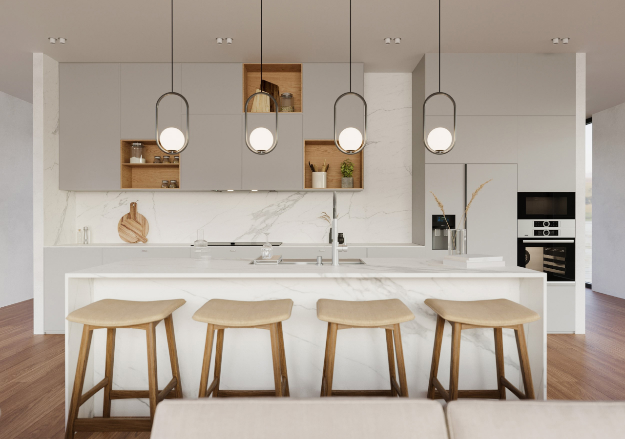
Neutral kitchens are not one-size-fits-all. You can build a neutral scheme around white and off-white, warm beige and cream, soft gray, or natural wood tones, depending on the mood you want and the light in your space. Each option stays calm and timeless, but they create different atmospheres, from bright and airy to warm and cocooning.
White and Off-White Kitchens
White and off-white kitchens are bright, clean, and timeless. Warm whites feel soft and welcoming, while cooler whites look crisp and contemporary. They are ideal for small spaces and open-plan layouts. White and wood kitchens, stone countertops, and minimalist frameless cabinets all sit comfortably in this palette.
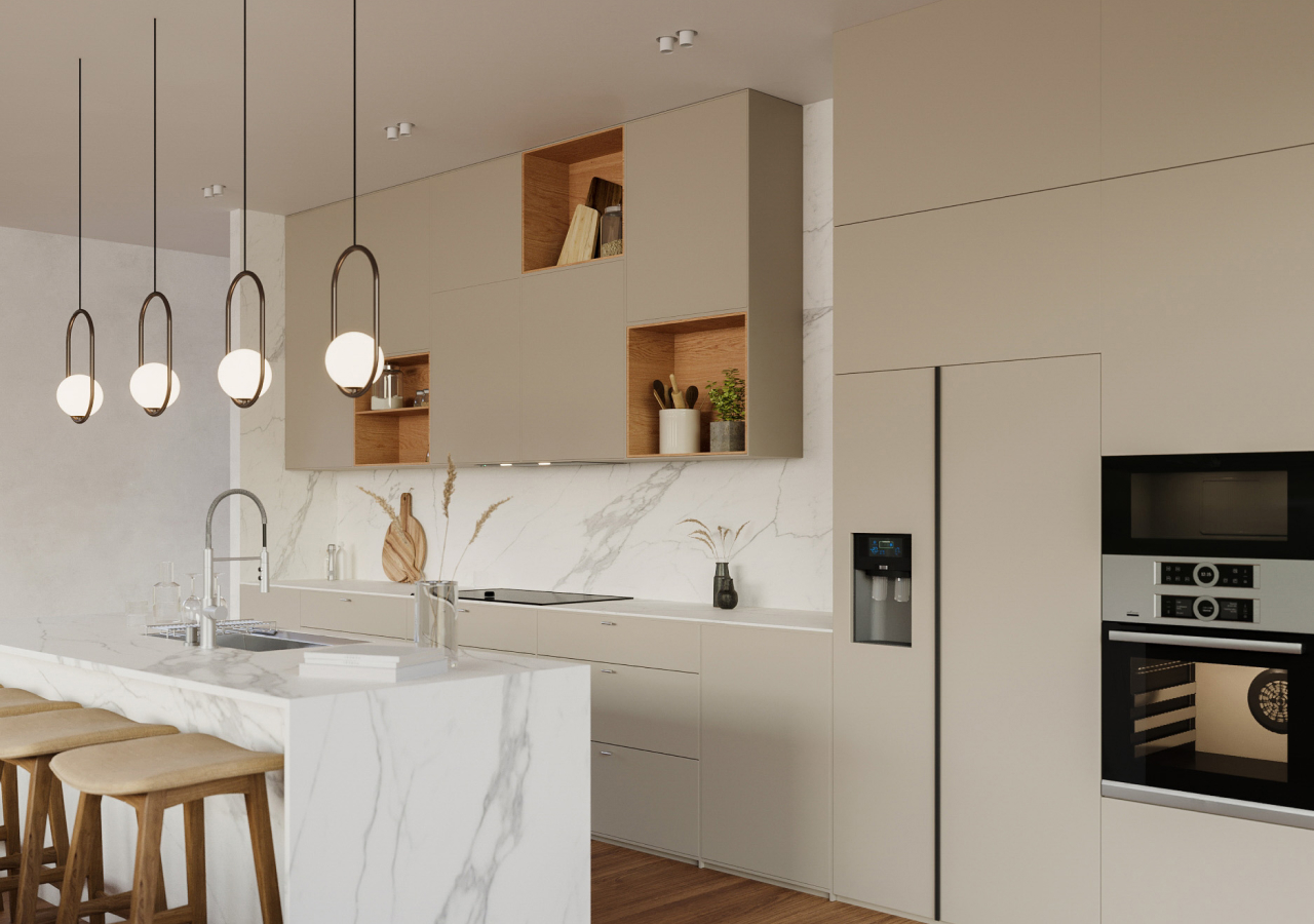
Beige and Cream Kitchens

Beige and cream kitchen designs create warmth and a lived-in feel. Beige cabinet colors can range from stone-like neutrals to soft, buttery tones. Veined quartz countertops and walnut or oak accents add depth. Beige kitchens work especially well in Scandinavian and Japandi-inspired spaces that value calm and texture, with clutter-free counters and gentle contrasts between upper and lower cabinets.
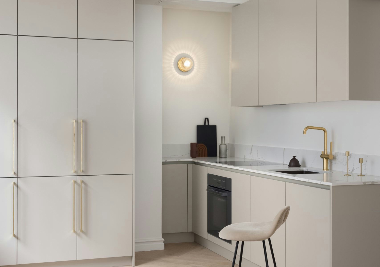
Gray Kitchens
Gray is a relaxed anchor for neutral kitchen design. Light dove gray feels fresh and airy. Deeper charcoals add sophistication and subtle contrast. Gray kitchens often pair with warm wood, integrated appliances, and simple lines. Used thoughtfully, gray supports a quiet, modern look rather than a cold one.
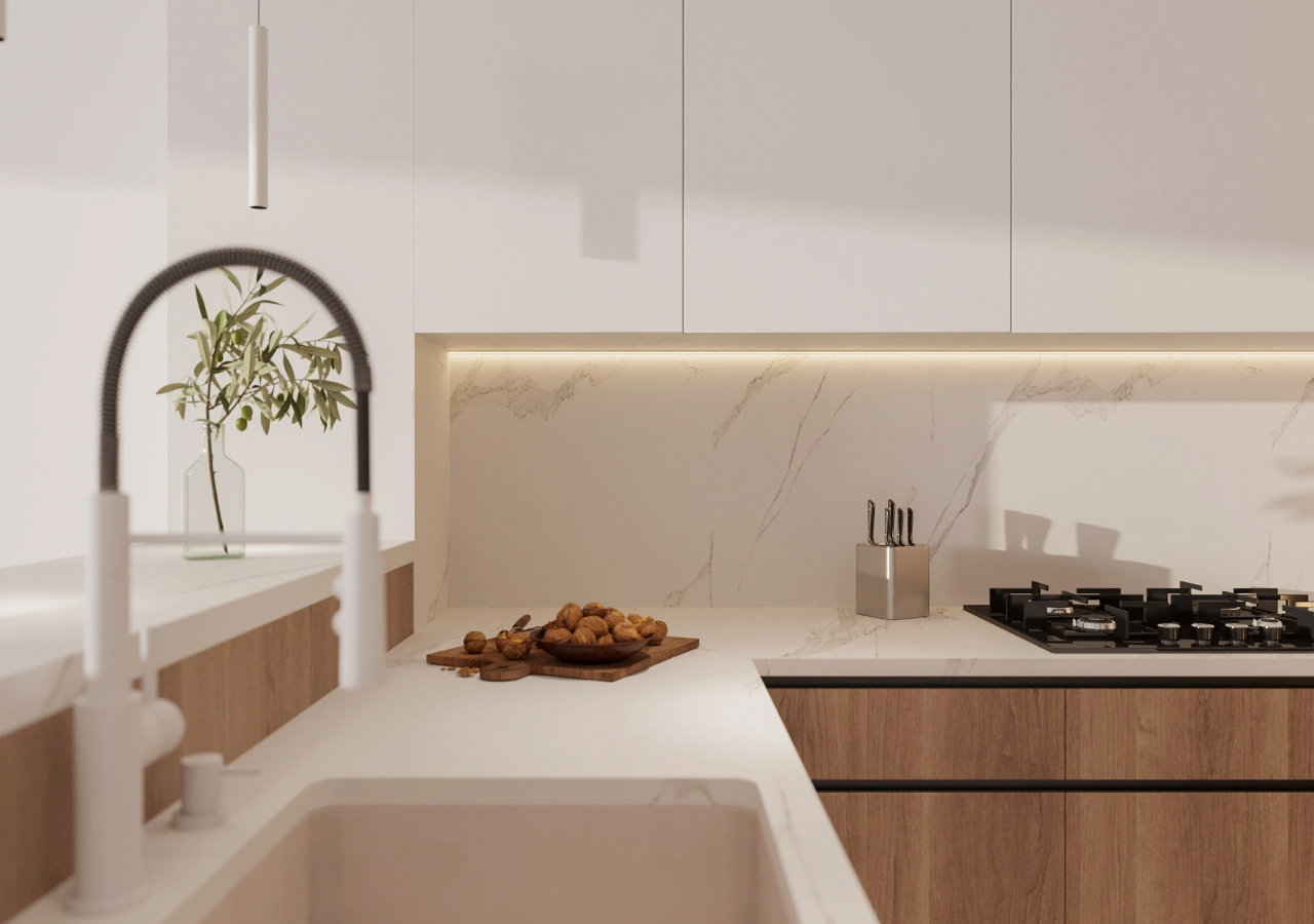
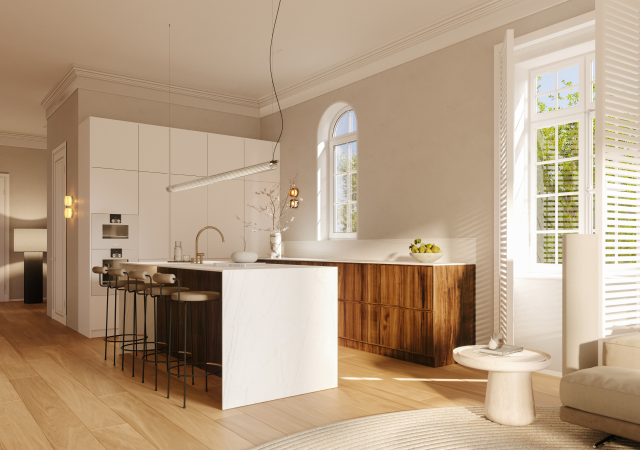
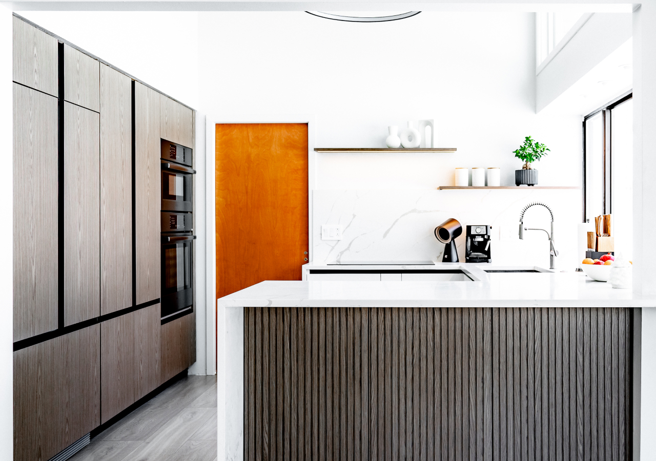
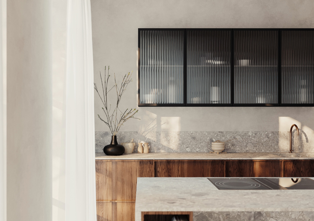
Earthy and Wood Tone Kitchens
.webp)
Wood tones bring natural warmth and character. Species such as light oak, American walnut, or ash provide a durable and refined base for neutral schemes. Wood-fronted cabinets, like in Corner’s Scandinavian kitchen Plain, create a calm, tactile kitchen with built-in features such as under-sink drawers and hidden appliance garages. In modern frameless cabinetry, wood grounds the design without overwhelming it.
Choosing the Right Neutral Color
Choosing the right neutral comes down to three things: your light, your layout, and the mood you want to create.
Warm vs. Cool Neutrals
Warm neutrals such as cream, warm beige, taupe, and greige create a cozy atmosphere and suit rooms where you want softness. Cool neutrals such as pale gray and clean white feel fresh and are ideal for bright spaces or very contemporary interiors. The right choice depends on your light, layout, and the mood you want.
| Aspect | Warm neutral kitchen | Cool neutral kitchen |
|---|---|---|
| Typical shades | Cream, warm white, beige, taupe, greige | Pale gray, crisp white, stone gray |
| Best suited for | Creating a cozy, welcoming feel; rooms with low or cool light | Bright spaces; very modern or minimal interiors |
| Pairs well with | Oak, walnut, brass, warm lighting | Black accents, stainless steel, concrete, light woods |
| Overall mood | Soft, relaxed, inviting | Clean, refined, crisp |
Monochrome vs. Layered Neutrals
.webp)
A monochrome neutral kitchen uses one main neutral across cabinets, walls, and sometimes worktops for a seamless, simple look. This works well in small spaces. A layered neutral scheme combines several related tones, for example warm beige cabinets with a pale gray backsplash and stone-look worktops. The result is depth and interest without strong color.
Undertones Matter
.webp)
Undertones are critical in neutral kitchens. Beige with pink, yellow, or gray undertones will react differently with your flooring, counters, and lighting. The same is true for whites and grays. Always test larger samples in your actual space before committing, so the full palette feels consistent.
Materials and Finishes That Complement Neutral Kitchens
Neutral kitchens come to life through texture and material choices. Painted cabinetry, pale oak, or American walnut veneer add tactile warmth. FENIX-style laminates in soft beige or gray provide a smooth, low-maintenance surface suitable for modern frameless cabinets.
Quartz in cream, taupe, or marble-inspired patterns pairs well with beige or gray cabinets. Concrete-look or stone-look worktops support minimalist and contemporary schemes. For backsplashes, subtle tiles in warm white, stone tones, or a soft-veined slab add movement without shouting.
Flooring should support the calm palette. Light wood floors, stone-look tiles, or polished concrete in soft tones all work well. Avoid extreme, high-contrast combinations that fight the neutral mood.
Conclusion
A neutral kitchen is both a safe choice and a deliberate one. It gives you a calm, refined backdrop that works with different light levels, layouts, and styles over time. Whether you prefer beige or gray, warm or cool tones, a neutral palette can evolve with you and still feel timeless.
Paired with integrated appliances, smart storage, and thoughtful lighting, a neutral kitchen feels bright, comfortable, and easy to use every day.
FAQ
What is the best neutral color for a kitchen?
The best neutral color depends on your space and lighting. Beige kitchens feel warm and timeless, while light gray offers a sleek, modern vibe. White and wood kitchens are always a safe, adaptable choice.
How to style a neutral kitchen?
Use a mix of textures—wood, matte finishes, stone-look countertops—and keep accessories minimal. Incorporate soft lighting, built-in features, and layered neutrals for depth.
What are warm colors for kitchens?
Warm neutrals include beige, cream, taupe, and warm white. These tones create a welcoming and cozy kitchen atmosphere.
What kitchen colors never go out of style?
Beige kitchen cabinets, white-and-wood combos, and soft gray cabinetry remain popular year after year for their timeless appeal.
How to style a beige kitchen?
Pair beige kitchen cabinet colors with natural stone or marble-look countertops, warm wood accents, and subtle lighting to create a layered, harmonious look.
How to warm up a neutral kitchen?
Incorporate walnut veneer cabinets, under-cabinet lighting, and warm-toned backsplashes or floors. Use tactile materials and avoid high-gloss finishes for a more organic feel.


