
.webp)
Japandi kitchen color palettes work best when you treat them as a repeatable system: one wood tone, one calm cabinet-front color, and one quiet stone surface, repeated across bases, tall units, and countertops. The goal is low contrast, low sheen, and consistent repetition so the kitchen reads as a single warm, minimalist composition instead of a set of separate choices.
In the palettes below, each idea explains where the colors should live in a real layout, how to keep the stone movement restrained, and which storage decisions help the palette stay calm in daily use. Start with the At-a-glance table to narrow your shortlist to two or three options, then use the five-step method near the end to test the palette against your light, layout, and habits.
These combinations are based on recurring specifications that consistently work in finished kitchens: a focused material set applied by zone so elevations stay clean. The implementation notes follow practical elevation planning and storage systems that reduce countertop clutter, because visual noise is what breaks Japandi fastest.
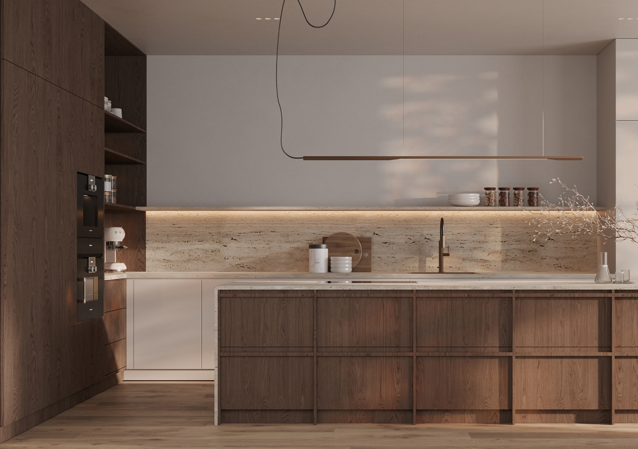
1. Light Oak and Warm White with Soft Stone
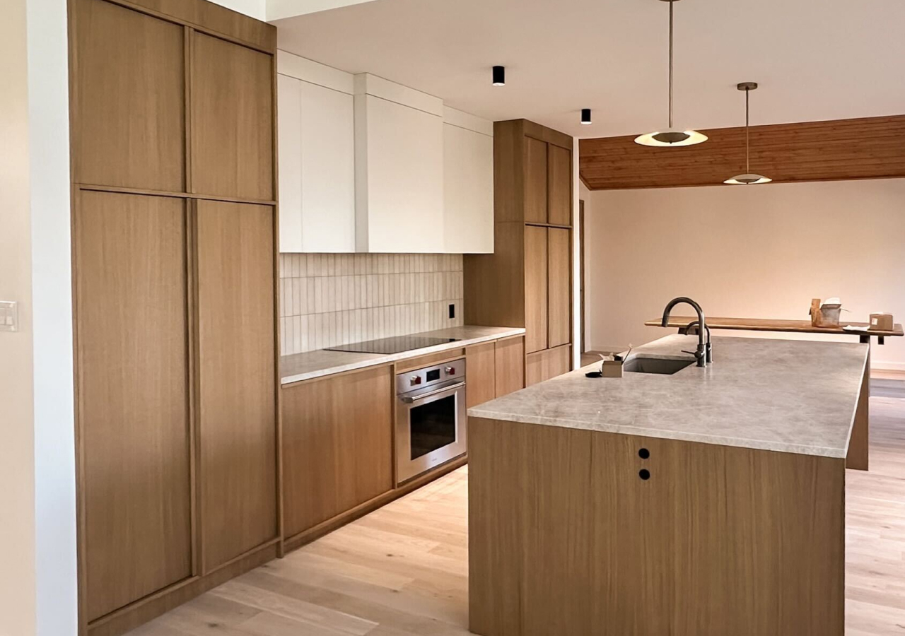
This is the most reliable Japandi white kitchen palette because it uses three low-contrast elements that naturally belong together. Warm white means a white with cream or sand undertones, and soft stone means off-white, beige, or warm gray with a subtle, barely noticeable pattern. The goal is a calm cabinet plane that still feels warm, not clinical.
Where the colors go
Oak japandi kitchen in Dallas shows how the recipe works in a real elevation: natural oak base cabinets and tall units carry warmth, matte off-white uppers keep the wall light, and pale stone stays quiet while adding structure.
Stone rules
Choose stone with restrained movement (think “tone first, pattern second”) so the wood grain stays the main texture. If you do a backsplash, keep it within the same stone family and avoid turning it into a feature wall.
Storage choices that protect the palette
The practical win is the “first impression” of calm: panel-ready appliance integration and a symmetrical layout reduce visual interruptions. For implementation, let warm white take the largest vertical planes, keep oak on touch zones like bases and the tall run, and choose stone with restrained movement so the wood grain can stay the main texture.
2. Light Wood and Beige Stone with Subtle Glass
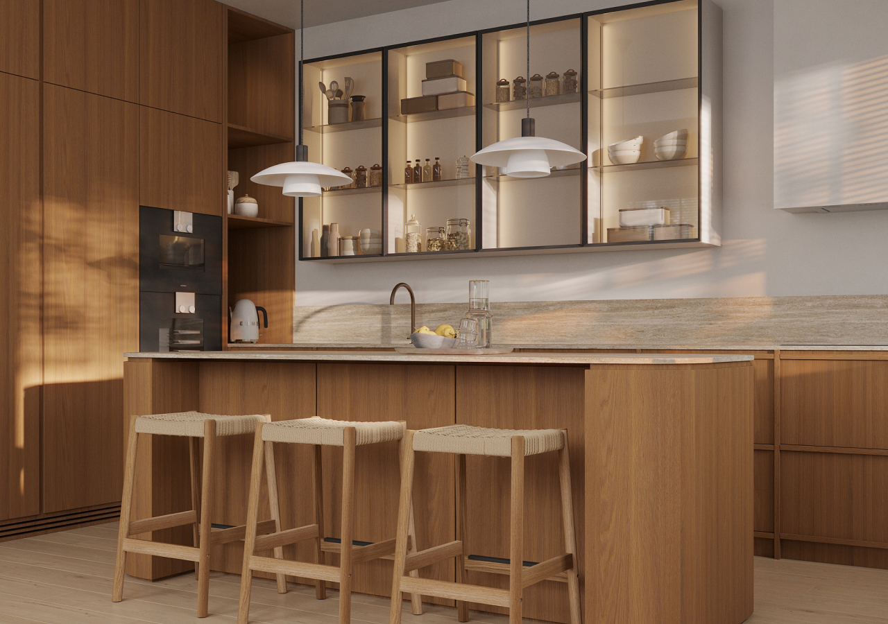
This palette builds depth without adding extra colors by using texture as the contrast. Beige stone is a warm neutral that hides daily marks better than bright white, and subtle glass means one controlled area of fluted or translucent fronts that adds lightness without turning storage into display. The definition of “subtle” here is simple: glass appears once, and the rest stays matte.
Where the colors go
Forma kitchen design frames the idea clearly: light oak fronts, beige stone, and the interplay of matte and glass textures.
Stone rules
Dekton used as both countertop and sink surface creates a unified, low-seam look. That cohesion matters in real kitchens because the sink zone is where clutter and visual seams multiply; when the work surface and sink read as one, the palette feels calmer even when the kitchen is in use.
Storage choices that protect the palette
To apply it, keep the main cabinet planes matte and quiet, place glass on a small upper run, and stay disciplined with a single beige stone tone across counters and any short backsplash return so the room reads as one system.
3. Walnut and Off-White with Warm Stone
This palette is a classic Japandi wood kitchen move because walnut provides depth while off-white keeps the elevation bright. Walnut reads warm and cozy while still minimalist when the texture stays smooth and the finish is matte. Warm stone here means beige, warm gray, or travertine-like tones that anchor the palette without high contrast.
Where the colors go
Japandi kitchen retreat in Upstate New York shows the balance in a lived-in way: American walnut cabinetry grounds the space, light walls keep it airy, and a warm white countertop on the island softens the composition.
Stone rules
Keep stone movement minimal so walnut stays the “main character.” If the room has low natural light, lean warmer (sand / creamy off-white) rather than cooler grays.
Storage choices that protect the palette
The functional layer reinforces the palette: an appliance garage and pull-out shelf for everyday appliances keeps counters clear, and organized drawers support the “nothing unnecessary” look that makes Japandi feel real rather than staged. For implementation, put walnut on the cabinet planes you want to feel intentional and grounding (often bases and tall units), keep off-white on the biggest visual fields (uppers, walls), and choose stone with minimal pattern.
4. Two-Tone Japandi with White Uppers and Walnut Bases

Two-tone works in Japandi when the split is consistent and the worktop acts as the unifier across zones. Two-tone means one finish family above (usually white) and one below (usually wood), with a single countertop tone repeated so the kitchen reads as one continuous volume. The calm comes from repetition, not variety.
Where the colors go
Nordic kitchen design describes the logic directly: sleek white top cabinets, walnut base cabinets, and a durable Dekton worktop that creates a warm connecting note between them, with upper cabinets and walls painted in a matching white hue for harmony.
Stone rules
Pick one worktop tone and repeat it across the main work zones (perimeter + island if possible). Avoid mixing stones “because the island is special”—that’s how the elevation starts to look assembled.
Storage choices that protect the palette
This palette is practical because it keeps eye-level planes light while using wood where wear is highest, which helps the kitchen stay composed over time. To apply it, keep the two-tone split consistent across the room, avoid introducing a third cabinet color “for interest,” and repeat the same stone tone on the island and perimeter so the palette feels planned rather than pieced together.
5. Warm Beige Cabinet Fronts with Light Wood Accents
.webp)
Warm beige is a high-performance Japandi cabinet color because it stays soft in daylight and forgiving in daily use, especially in matte finishes. Warm beige means sandy or creamy undertones, and matte matters because glare adds visual noise and makes surfaces feel busier. This palette reads calm because contrast stays low while wood supplies the warmth cue.
Where the colors go
Beige works best on the largest cabinet masses, often tall pantry blocks, because it softens the biggest volume without making the kitchen heavy. Light wood can then repeat on bases or an island wrap to keep the room warm and grounded.
Stone rules
Keep the countertop within the same warm family (off-white, beige, warm gray). Avoid bold veining so the beige fronts stay the calm foundation rather than competing with the worktop.
Storage choices that protect the palette
Implementation is mostly about restraint: keep the material list short and repeat two or three main materials consistently. That discipline is what makes beige feel intentional instead of “safe.”
6. Deep Navy Cabinet Fronts with Fluted Wood Warmth
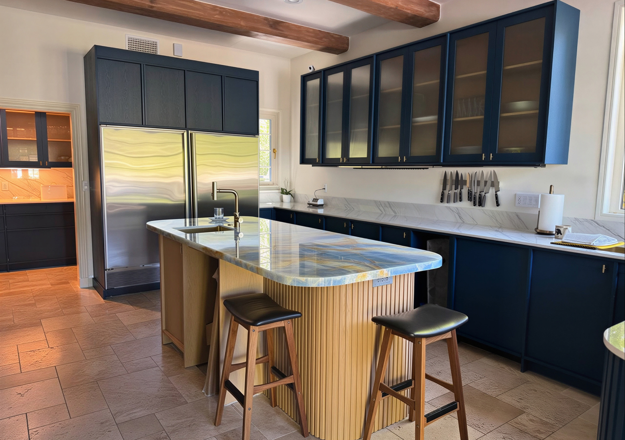
Deep navy can still read Japandi when it is treated as a controlled cabinet plane and paired with warm natural wood and sand-toned neutrals. Controlled means one dominant dark color for the main cabinetry, then wood and light walls that soften the mass so the kitchen stays balanced. The palette stays short: dark fronts, warm wood texture, and a cohesive stone surface.
Where the colors go
Japandi-inspired kitchen in Pacific Palisades shows the recipe with a bolder cabinet choice: deep navy cabinetry, sand-toned walls, and a fluted wood island that turns the dark into something calm and inviting.
Stone rules
Use one surface family across primary work zones (and consider continuing it up the wall in a restrained backsplash) so the dark cabinetry doesn’t get fragmented by extra materials.
Storage choices that protect the palette
Fluted glass uppers add lightness without turning the whole kitchen into an open display. The storage layer is doing real work too: a hidden pantry with sliding doors, spice racks, organizers, and a sink-cutout drawer all help keep counters quiet so the palette reads as designed rather than decorated.
7. Dark Wood and Warm Off-White with Layered Lighting
A darker Japandi palette stays serene when the light tone is warm and matte, and lighting is layered across the work zones. Layered lighting means under-cabinet or under-shelf light supports ambient light, so materials read soft rather than harsh. The visual goal is grounded contrast that still feels calm.
Where the colors go
Element Air kitchen spells out the balance: dark wood cabinetry as an anchored foundation, a light matte backdrop to soften it, and under-cabinet LED strips that add a warm glow while improving function.
Stone rules
Keep stone calm and supportive (low movement, warm-neutral tone). In darker palettes, stone should read like a quiet plane—not the “feature.”
Storage choices that protect the palette
The palette is also supported by how storage is handled—an island with pull-outs, a pantry wall with integrated appliances, and an appliance garage that keeps daily machines off the counter. To apply it, keep dark wood concentrated on bases, island, and selected tall blocks, use warm off-white on the biggest vertical fields, and treat lighting as part of the palette so the room stays calm in the evening as well as in daylight.
8. Matte White and Light Oak with Quiet Stone Texture
.webp)
This palette feels quietly premium because the materials have texture up close and restraint from across the room. Quiet stone texture means porous or softly patterned surfaces that add depth without dramatic veining, and matte white is used to keep cabinet planes clean and low-glare. Light oak provides the grounding note that keeps the white from feeling flat.
Where the colors go
Element Light kitchen describes the combination directly: light oak fronts, stone-look countertops with matte texture, and soft contrasts that keep the elevation calm.
Stone rules
Choose a stone that reads textured rather than graphic, so the wood grain stays the main character. If you extend stone up the wall, keep it subtle and consistent—no big “waterfall veining” moments.
Storage choices that protect the palette
The functional benefit is that the palette stays calm even when the kitchen is working; hidden storage prevents visual clutter, and matte finishes make fingerprints less noticeable, which helps the “calm surface” look last through daily use. For implementation, let matte white carry large wall planes or upper volumes, use light oak as the anchor on bases or tall units, and choose stone that reads as a quiet plane rather than a feature pattern.
9. Light Oak and Pale Stone with Black Fluted Uppers
This palette is a modern Japandi approach that uses light wood as the main warmth, pale stone for calm, and a controlled dark accent for definition. “Controlled” here means one dark zone, often uppers or a single cabinet run, with texture (like fluted glass) that keeps it soft rather than heavy. The result is contrast that still feels livable.
Where the colors go
Chicago Japandi kitchen shows the idea in a practical apartment context: light oak veneer fronts establish warmth, pale countertops keep the room bright, and black upper cabinets use fluted glass fronts to add texture and lightness.
Stone rules
Repeat the pale stone on the island and perimeter so the room stays unified. If you need a short backsplash return, keep it in the same stone family and avoid adding a second “accent” surface.
Storage choices that protect the palette
The palette stays calm because the storage system is doing its job—hidden drawers behind a single door, pull-outs, waste bins, and corner pull-outs keep everyday items organized, so the elevation stays clean. To apply it, keep the wood tone consistent across the main fronts, repeat the pale stone across primary work zones, and limit the dark accent to one upper zone so it reads as a deliberate frame rather than a third color fighting for attention.
10. Dark Oak Cabinet Fronts with Stone-Like Gray Worktops
This palette is a Japandi staple for a more architectural mood: dark oak adds warmth through grain, and stone-like gray keeps the countertop calm and mineral. Stone-like gray here means a low-contrast gray surface with minimal veining, so it reads as a quiet plane rather than a feature pattern. The result is grounded contrast, not drama.
Where the colors go
The Kyoto kitchen shows the recipe clearly with dark oak fronts paired to a gray worktop that doesn’t compete with the wood texture, plus restrained details that keep the cabinet planes clean.
Stone rules
Repeat the same gray across main work zones so the kitchen reads as one system. Avoid bold stone movement that would fight the wood grain, especially on large surfaces.
Storage choices that protect the palette
In application, keep the tall run reading as one continuous block, and plan storage to minimize countertop parking. That combination keeps the kitchen feeling calm in daily use because the main materials remain visible.
Conclusion
Japandi kitchen color palettes stay timeless when they’re treated as a system instead of a collection of pretty samples. Choose one wood tone, one calm cabinet-front color, and one quiet stone surface, then repeat them across bases, tall pantry blocks, and countertops so the room reads as a single composition. Pair that with storage that prevents countertop clutter, and the palette has a chance to stay visible in real life.
If you want help translating one of these recipes into your layout—where the wood should live, how tall blocks should read, and which worktop tone will stay calm in your light—explore the collections for real references, then book a consultation to pressure-test the palette against your space and habits.


